About Me!

This blog is about my musings and thoughts. I hope you find it useful, at most, and entertaining, at least.
Other Pages
Presence Elsewhere
So You Want to Make a Map
Date: 2014-09-13
Tags: GIS QGIS Census TIGER
So you want to make a map but have no experience in doing so and don’t know where to start? Well you’ve come to the right place! In this tutorial I will show you where to find some basic spatial data, how to use it, and some tricks when rendering it.
Data Background
Firstly, we need data to make the map with. I’m going to be using the TIGER data from the US Census Bureau. They have vast troves of spatial data (among the even more vast troves of data that you normally think of when I say “census”). All of this data is organized by FIPS codes.
FIPS codes “combine” to produce longer codes for more specific things. For instance, Pennsylvania is 42 and Allegheny County is 003 in Pennsylvania, so the unique code for Allegheny County, PA is 42003. The following chart is the organization of all the data.

Taken from TIGER Tchnical Documention, Chapter 3
As you can see, States have counties, and counties have Census Tracts, which in turn have Block Groups. You’ll notice that School Districts, Congressional Districts, and State Legislature districts are contained within a State (which makes sense, e.g. a school district can span county and municipality lines). Note the “County Subdivisions” under Counties; this is also known as municipalities (e.g. towns, cities, townships, boroughs, &c). While Census Tracts are normally contained by municipalities, they are not always.
If codes are additive, how does one distinguish between a county subdivision and a census tract? Good question. The answer is that they’re different lengths:
- Pennsylvania is 42 (2 characters)
- Allegheny County is 42003 (5 characters)
- Pittsburgh is 4200361000 (10 characters)
- Tract drawn around Schenley Park is 42003980500 (11 characters)
- The Block Group inside that tract is 420039805001 (12 characters)
So, what happens when new things are added? Great question! The Census Bureau keeps these lists in alphabetical order, so they can’t just (well, don’t want to) add it to the end of the list. What they do is skip codes between existing items. Search for “Pennsylvania” in the FIPS look up link below and you’ll notice:
| County FIPS | Name | |
42001 | Adams County | |
42003 | Allegheny County |
|---|---|---|---|---|---|---|---|
| 42005 | Armstrong County | ||||||
| ….. | ….. | ||||||
| 42099 | Perry County | ||||||
| 42101 | Philadelphia County | ||||||
| 42103 | Pike County | ||||||
| 42105 | Potter County | ||||||
| ….. | ….. |
So if, say, Pittmesh County, it would become 42104. If Pennsylvania then added a “Pickle County”, well, it would have to be bumped to the bottom of the list. Sorry Pickle County.
Note that “ZIP Code Tabulation Areas” is off to the side under nation. ZIP codes are rarely something you want to be doing analysis with. ZIP Codes aren’t polygons (they aren’t defined by some space on the surface of the Earth), they are instead lines representing mail routes served by a Post Office. The ZCTA files (and others that you’ll find online) try to convert them to polygons the best they can, but it’s not always possible to do with 100% accuracy. They are also at the national level because they can and do span state boundaries.
You’ll note that things like roads and railroads aren’t listed. They are normally broken down by county for ease of use, but are more-or-less lines and don’t belong in this hierarchy (or could be stuffed in at the national level, I suppose). I will note, though, the road and railroad files aren’t always 100% accurate, though I find them good-enough for everyday usage. When they aren’t, I try to see if the municipality I’m working with has their own files or search for the state’s spatial repository (Pennsylvania’s is PASDA) every state has one.
OK, so now we know how this data is organized, let’s get files! First thing is to find the FIPS code for your county. The Census provides a nice tool to get that; just select your state and then look for your county name. (There are many other tools available everywhere as well, just search if you don’t like this one). For this tutorial I’ll be focusing on Allegheny county, but feel free to use your own county when attempting this.
Getting Data
Let’s use the 2014 TIGER/Line Shapefiles (go to that link and then click FTP site). The TIGER page also contains information and documentation about the files and their contents if you’d like to learn more.
First let’s grab the COUNTY file. There is only one because it’s small even thought it contains every county in the union.
Next, lets grab county subdivisions, COUSUB for the state of interest. For this tutorial we’ll use Pennsylvania’s, which is named tl_2014_42_cousub.zip because Pennsylvania is state 42.
Now let’s do ROADS. Again we’ll use Allegheny County’s, named tl_2014_42003_roads.zip because Allegheny County is 42003.
We’ll also grab the RAILS file because I like trains. (No really, I do.)
Once all of these have been downloaded, unzip them each into their own directory. The thing about shapefiles is that they’r not really a “file”, they’re at least 3 (geometry file, database file, and an index file. Usually there is a projection file too, because you need to know this to use it.) You need to keep all the files that appear when you move them around.
Shapefiles contain just that, shapes. They are a form of “vector” format, similar to SVG if you’re familiar with those, that lets you zoom in, rotate, and move the map without ever losing quality. How? Instead of storing a line as “There is a point at X. There is a point at X+(just a little bit). There is a point at X+(just a bit more yet)….” it stores “There is a line from X to Y” and the computer figures out how best to draw it. The other format (“There is a point…”) are known as “Raster” formats, like JPEG, GIF, PNG, and TIFF among many others are raster format’s you’ve probably used (there are jpgs and pngs on this site and don’t tell me you haven’t seen any cat gifs
(What are projections? Well, they’re how you convert points on the globe to points on a flat surface. There are many different ways to do this. WGS 84/EPSG 4326 is what’s commonly known as “GPS Coordinates”. The census data you just downloaded is in EPSG 4269 which is a more accurate version for use in the United States and Canada. These are all in degrees.
Some projections are in feet. For instance EPSG 2272 can be used in the lower half of Pennsylvania for very good accuracy. (Feet from what? The lower left corner of the state of course!) Also since it’s in feet it makes distance calculations easy!
For the rest of this tutorial you won’t need to care about any of this, QGIS will read the project file with the shape files and figure it all out. I just wanted to let you know there is a whole other (confusing) world out there.)
Viewing
Download and install QGIS, which is a Free software package that is similar to ArcGIS but free, as in beer and speech. If you ever need help, QGIS has many places where you can turn for community support which I’ve always found very helpful. (If you’re a company, Commercial Support for QGIS is also available, but for you and I IRC, the mailing list, or gis.stackoverflow are adequate (Trust me, I’ve learned a ton and have gotten help solving I can’t count how many issues from them).
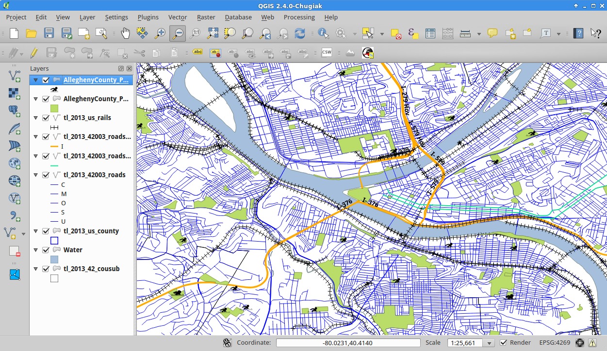
Once installed, open it. You should see a screen similar to the one below.
We’ll be using QGIS 2.4.0 – Chigiak for this tutorial.
Counties
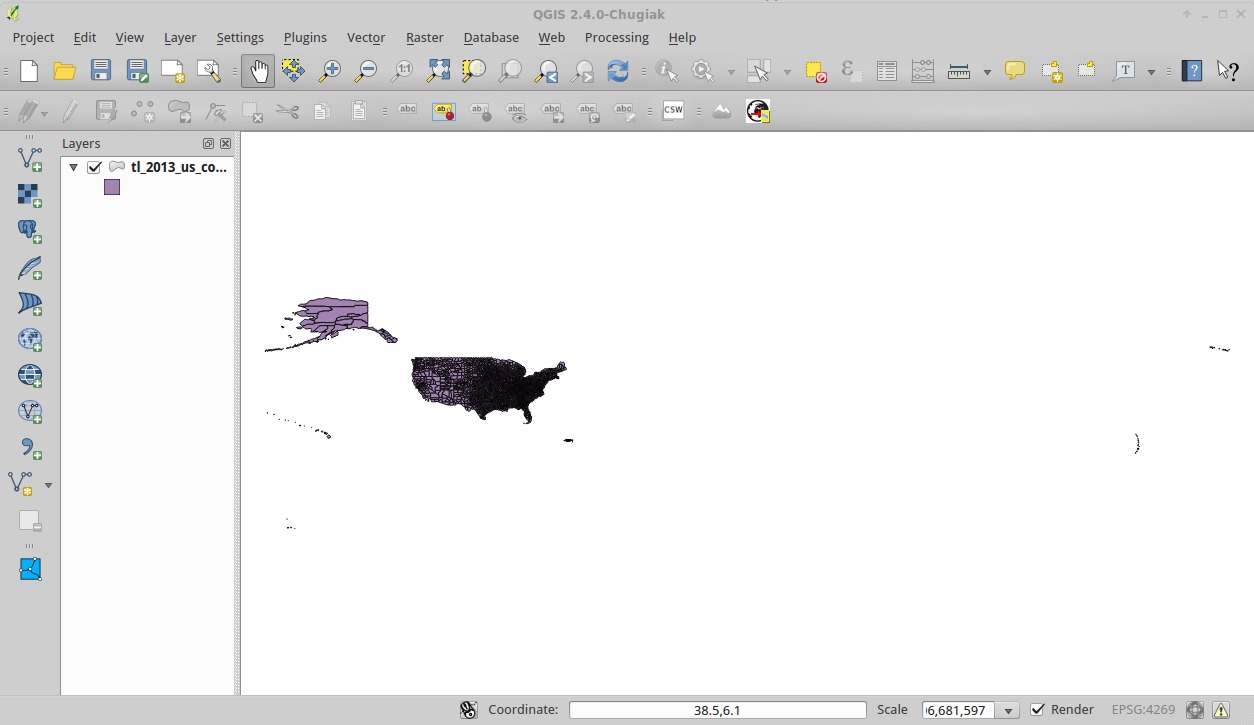
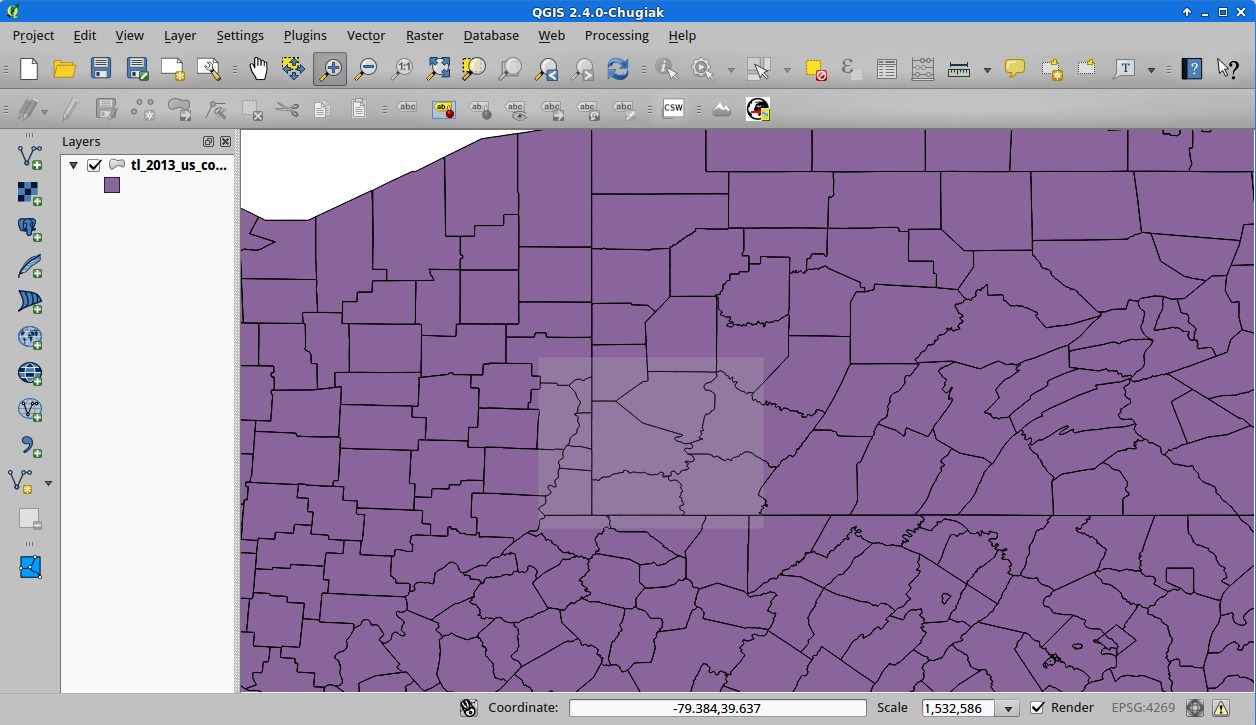
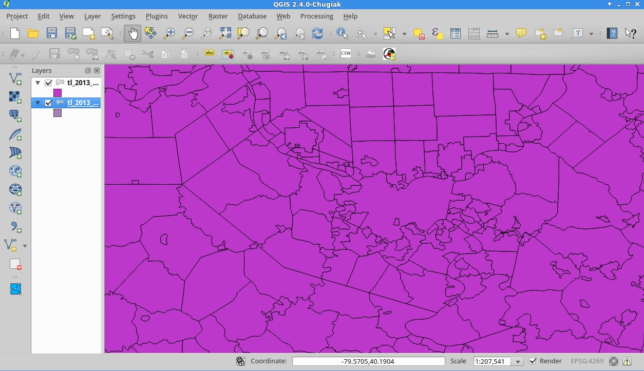
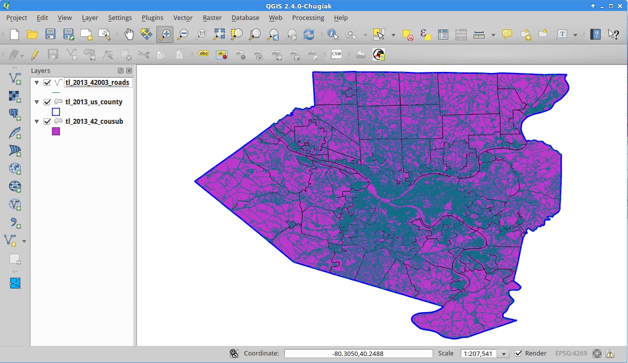
To add a shapefile layer to our canvas you can click on the little V-looking-with-a-green-plus button on the left (![]() ), or you can go to Layers > Add Vector Layer in the menu. Select the .shp (the file that ends in the shp extension) from where you unzipped the COUNTIES file above. Once loaded, you should see all the counties in the country.
), or you can go to Layers > Add Vector Layer in the menu. Select the .shp (the file that ends in the shp extension) from where you unzipped the COUNTIES file above. Once loaded, you should see all the counties in the country.
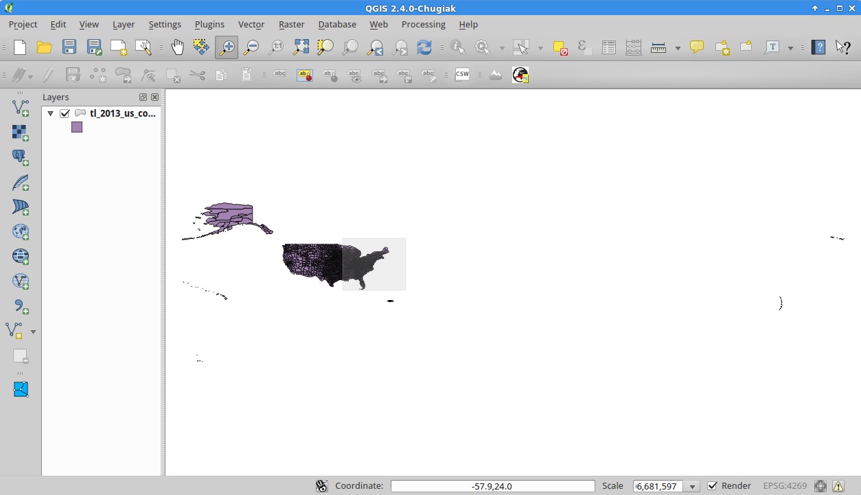
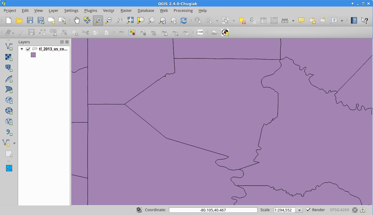
Using the Zoom tool (![]() ) draw rectangle around the area you’re interested in. Feel free to zoom in little by little. You don’t have to find it right away.
) draw rectangle around the area you’re interested in. Feel free to zoom in little by little. You don’t have to find it right away.
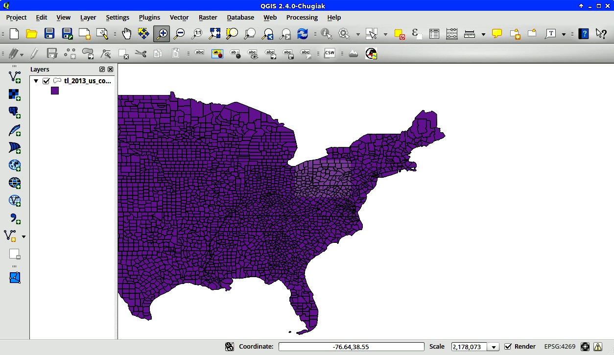
Until you’re mostly over the county you want.
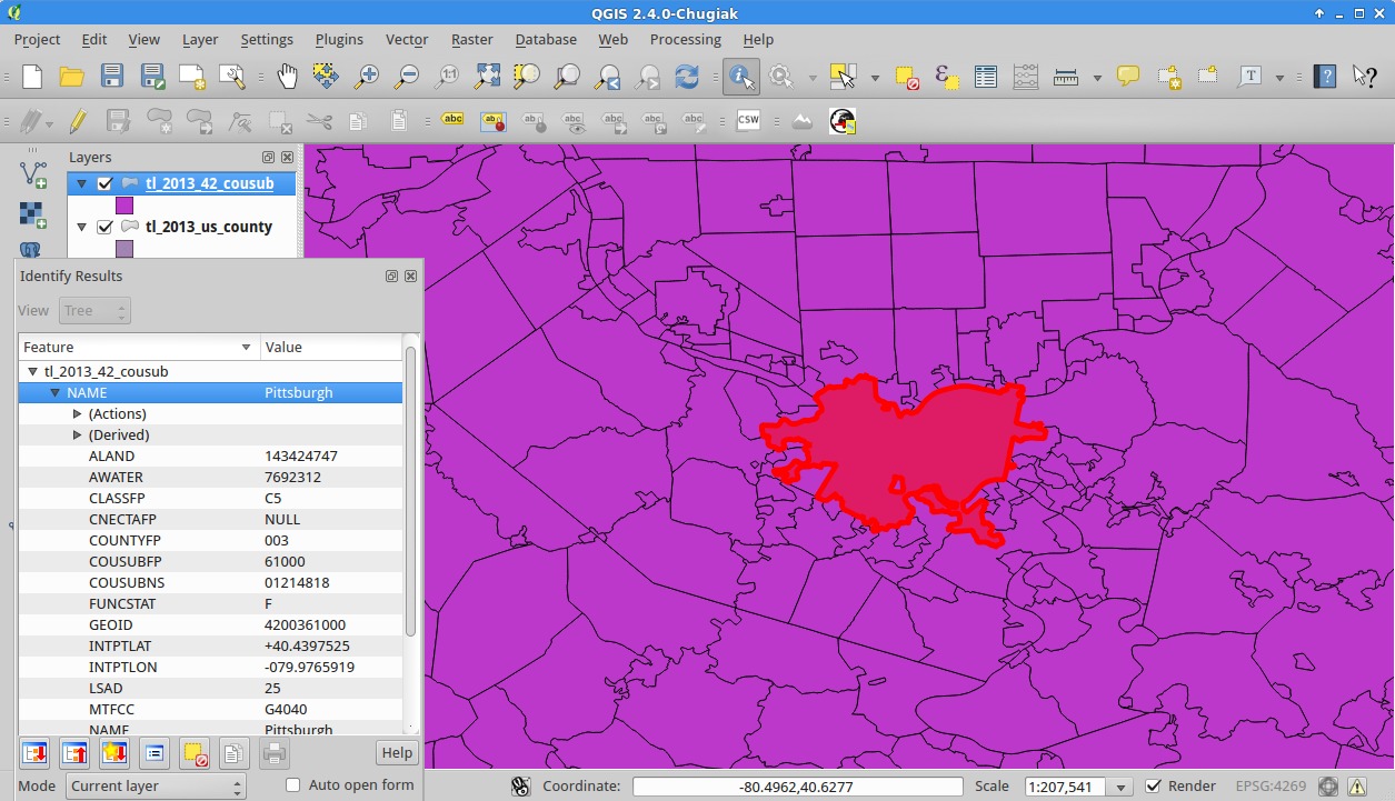
To view information about a feature, use the “Identify Features” ( ) button and then click on the county you’re interested in.

Now you can see all the information associated with this feature. Note the “STATEFP” is 42 and “COUNTYFP” is 003. Also, the “GEOID” is 42003, which is what we expected for Allegheny County. You can look up the meaning of some of the other fields in the TIGER documentation. (Click the “Hand” tool () to deselect everything and continue to pan the map as usual.)
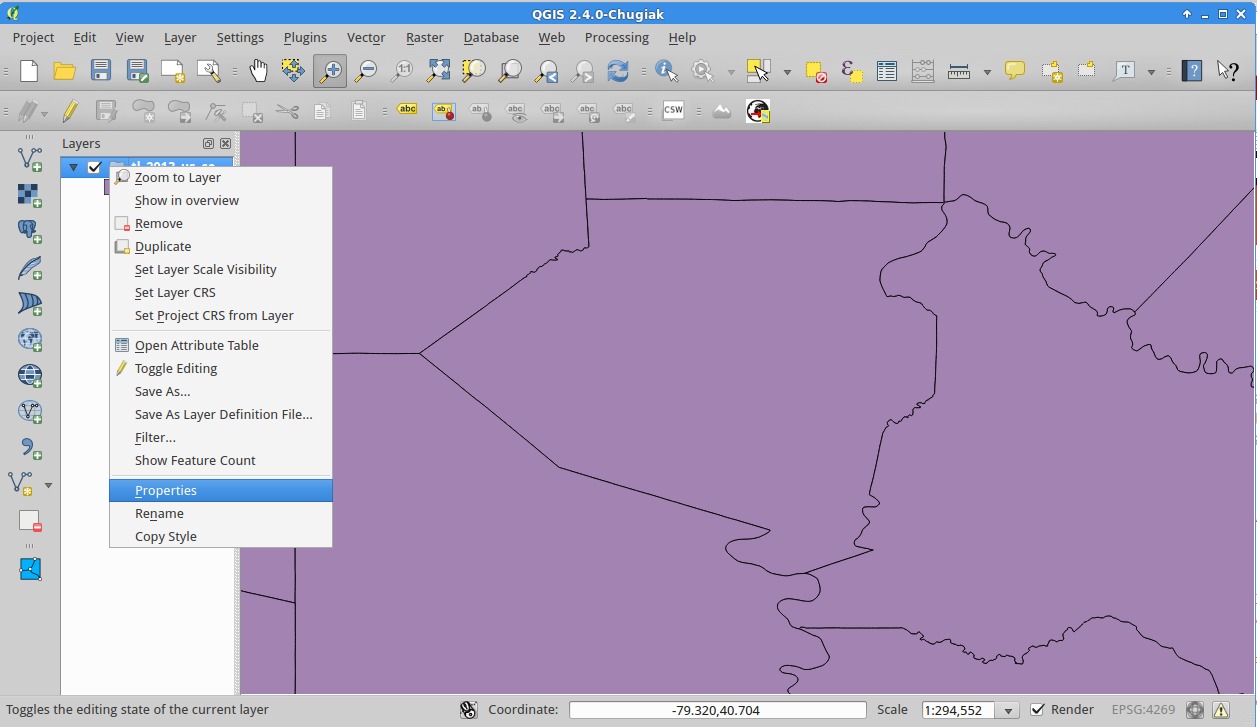
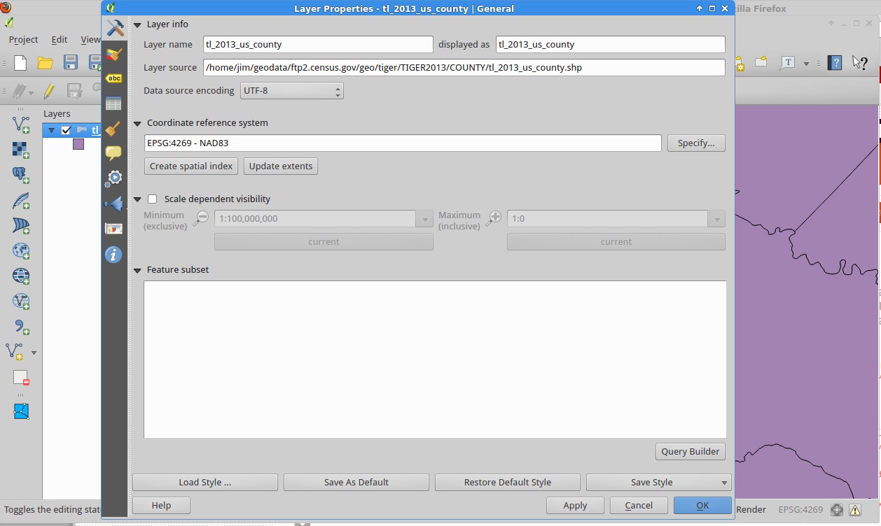
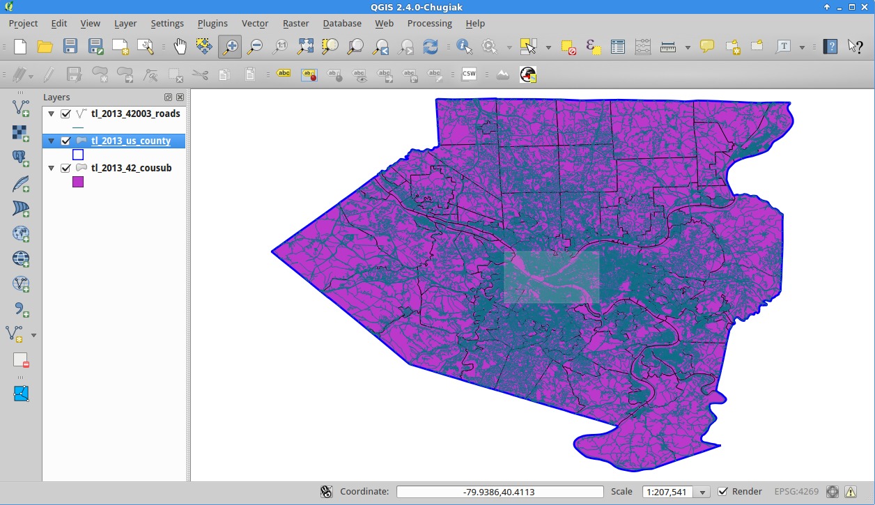
Now, as an exercise in being able to query and filter your data, and to remove some clutter, right-click on your layer and go to properties.
Now, click “Query Builder”, and you should be presented with a screen like this.
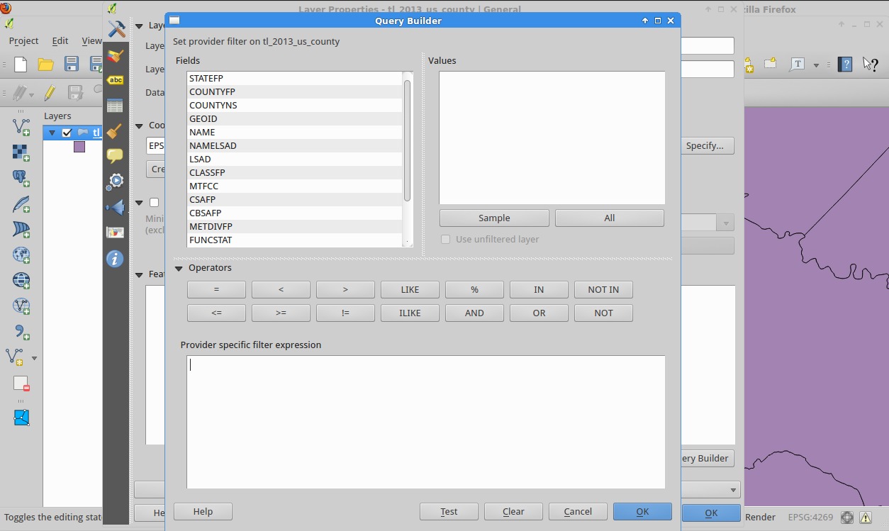
You’ll note that it’s displaying all the fields on the left. Select one and click “Sample”. (That’s one way just to check if a field is what you think it is. Use the “Attribute Table” I’ll show you later to do a more in-depth looking-at of the data.)
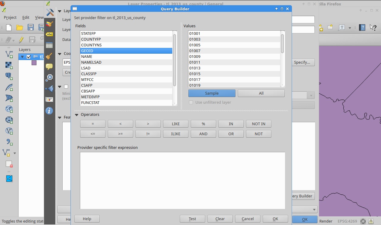
We want the “GEOID” column that contains the FIPS code, and from the sample data, you can see that those look like county FIPS codes. The filter expression language is similar to SQL, but if you don’t know SQL, that’s OK. We want the county with a GEOID of 42003, so we enter “COUNTY” = ‘42003’ (NB(Nota bene): Use double quotes for fields and single quotes for values. Failure to do so will result in errors.) You can click “Test” to see how many results your query finds and if it’s valid, useful for a quick, well, test, of your query.
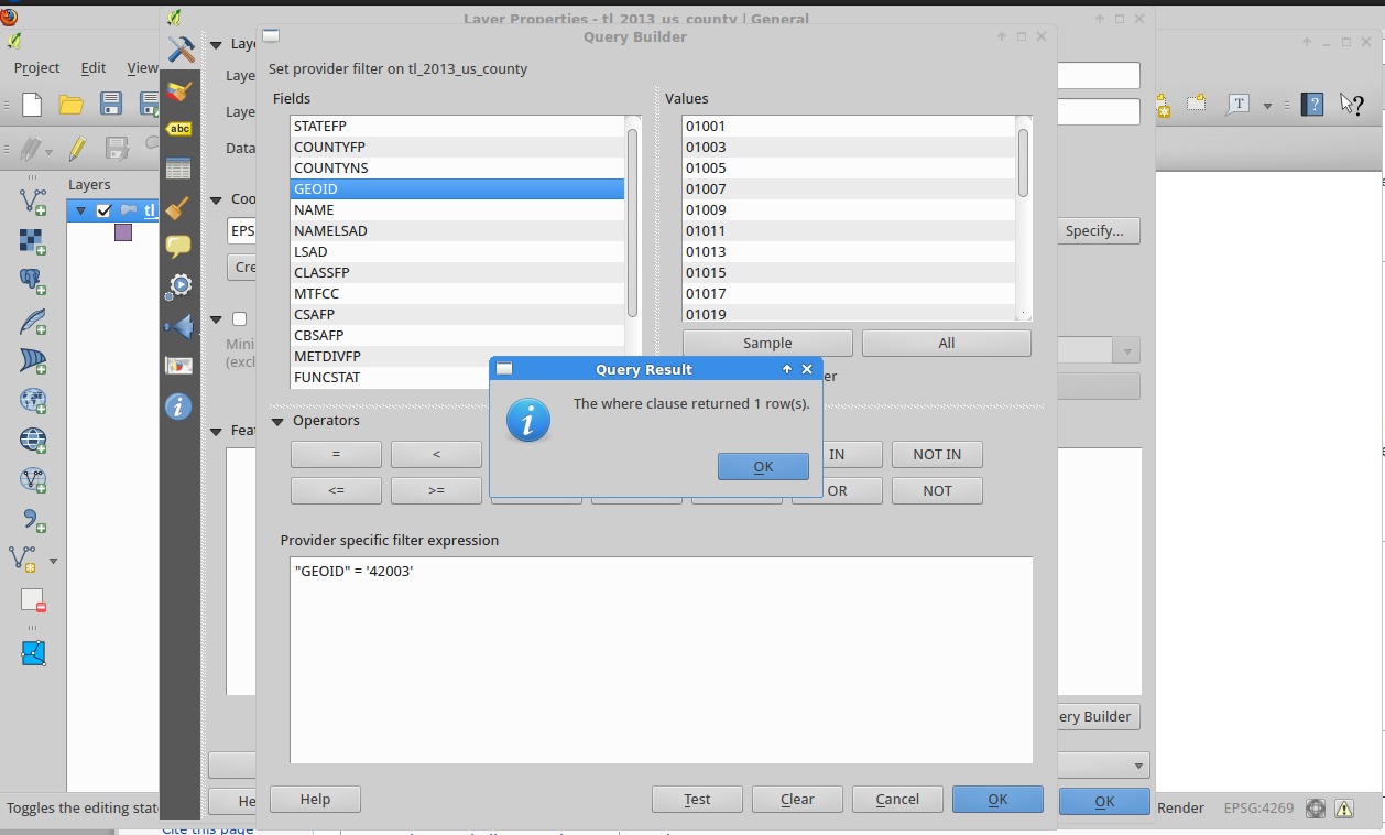
In this case we want only a single result because that ID should be unique!
Click OK on the test popup and then on the main dialog to gt back to the layer properties. Then Click OK to go back to the main window.
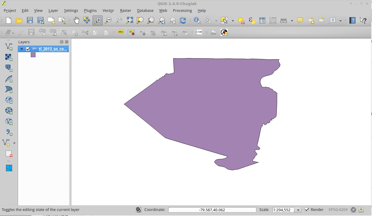
Now, right click on the layer and go to “Zoom to Layer”.

Municipalities
Now, add the county subdivision you downloaded just as you did the county file originally.
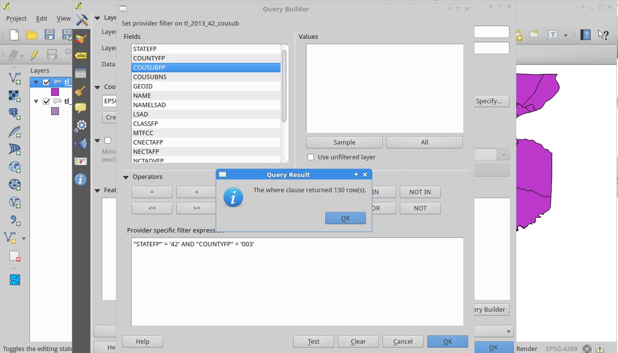
So great, now our county is covered. Make sure your municipality layer is selected and then, identify a feature, just like you did for the county (“Identify Feature” only identifies features in the currently selected layer. For fun, select the county layer and click where your county should be; you’ll see it become highlighted).
If you remember, municipalities are part of counties. In that info box, you’ll notice that the “STATEFP” is 42 and “COUNTYFP” is 003. What we can do is filter the municipalities to show only the ones in our county! (With the query “STATEFP” = ‘42’ AND “COUNTYFP” = ‘003’
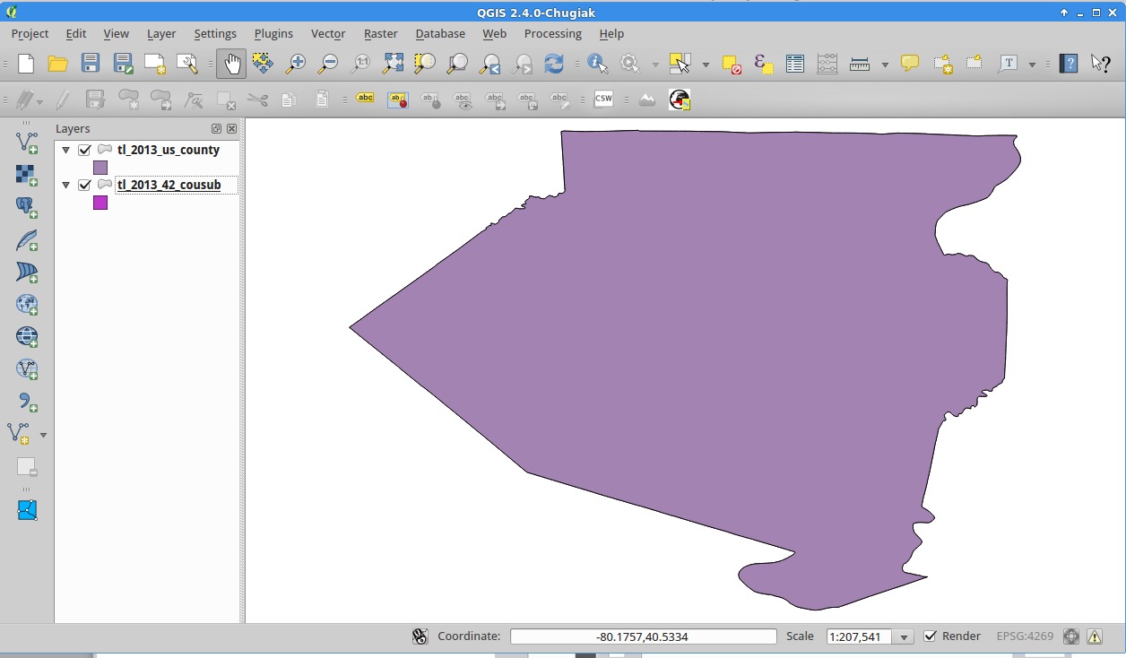
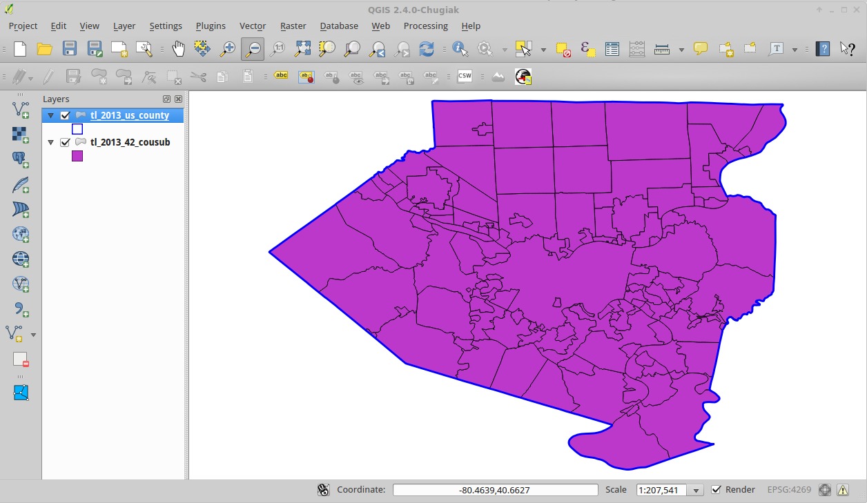
As you just saw, the order of the layers is the ordered rendered; those lower in the list are on the bottom. Drag the county layer above the municipality layer, and you’ll see all your municipalities be covered by the county.
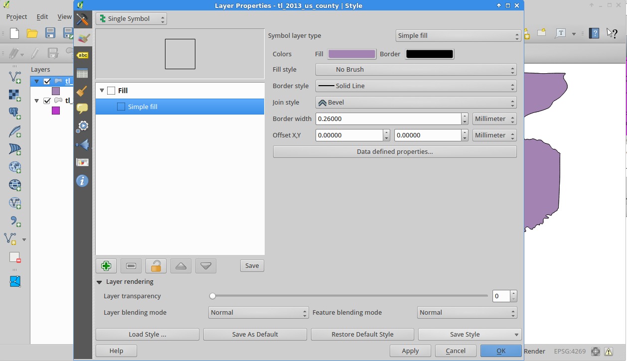
What I want to do now is to make the county layer have no fill and a think blue border. Go back to the layer properties for the county, and click on the paint brush on the left side (), the second in the list, to get to the Style properties.
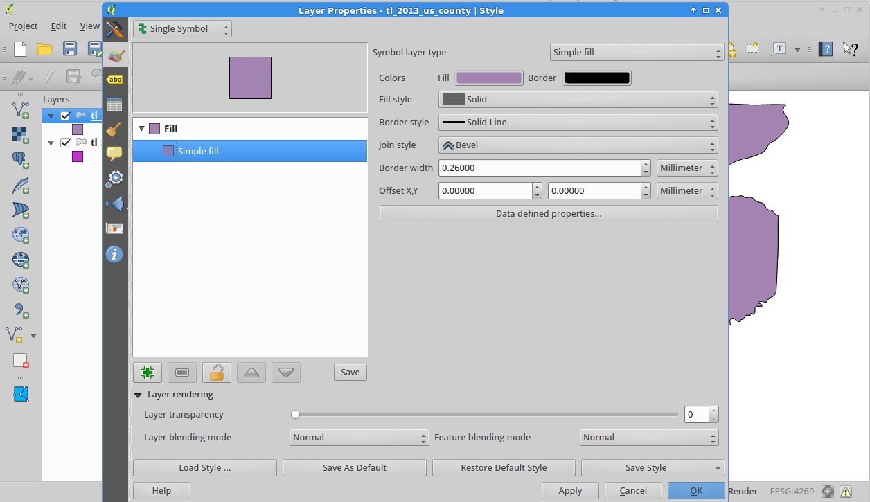
Now select “No Brush” for the fill. Note some of the other brush styles.
Once you’ve done that, click on the border color and change it to blue and the “Border Width” to 0.75.
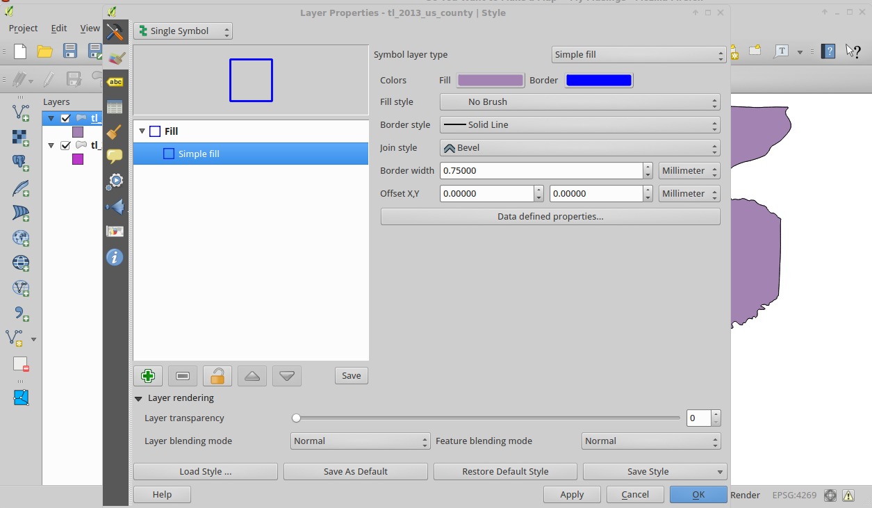
Then click OK
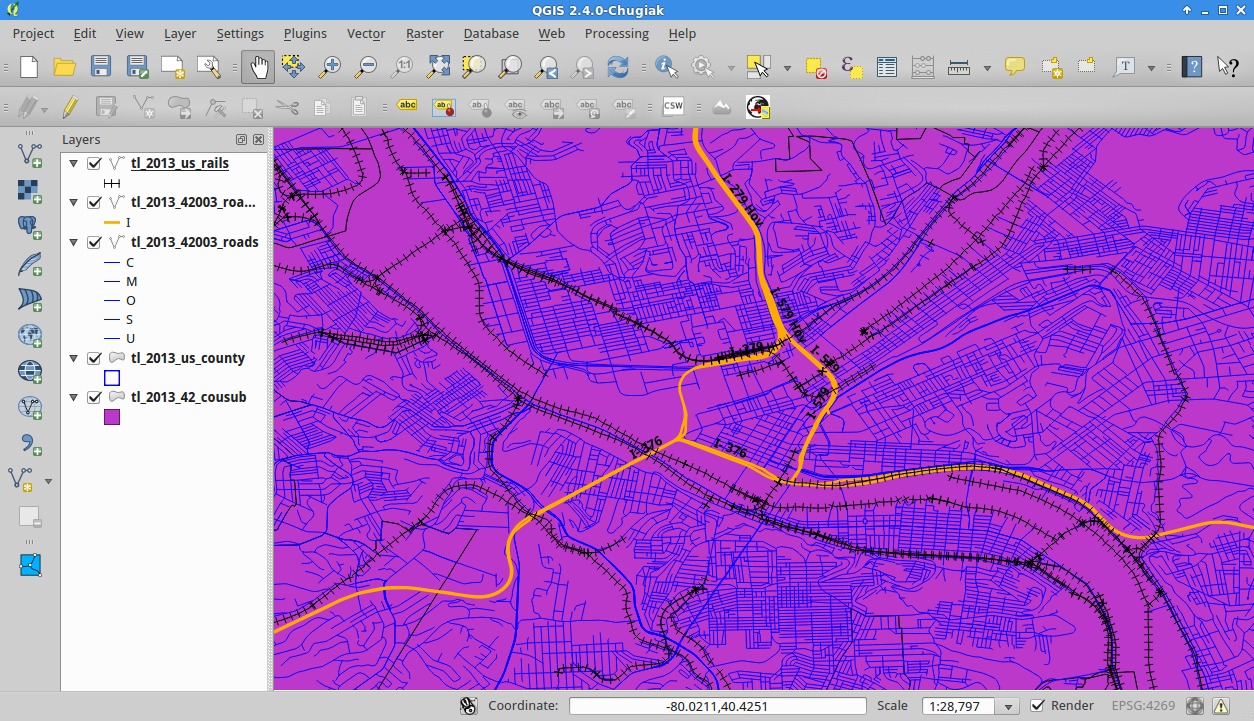
Roads
Now add the ROADS shapefile that we downloaded.
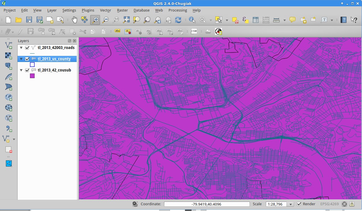
Let’s zoom in to a place of interest; in this case, let’s do Downtown Pittsburgh.
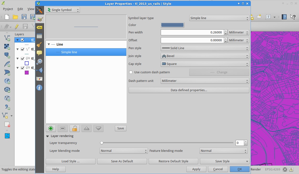
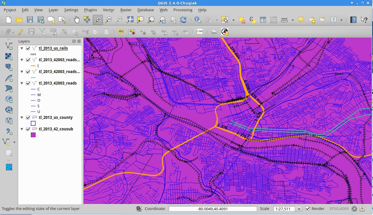
Railroads
Let’s take a quick detour and show the railroads now. Load that file.

If your computer is like mine, it picked a terrible color for them. Let’s change it to, instead of being a line, being a line with ticks like on many maps. Go back to the layer style.
For the “Symbol layer type” use the drop down to select “Marker Line” and then select “Simple Marker” in the tree to the left.
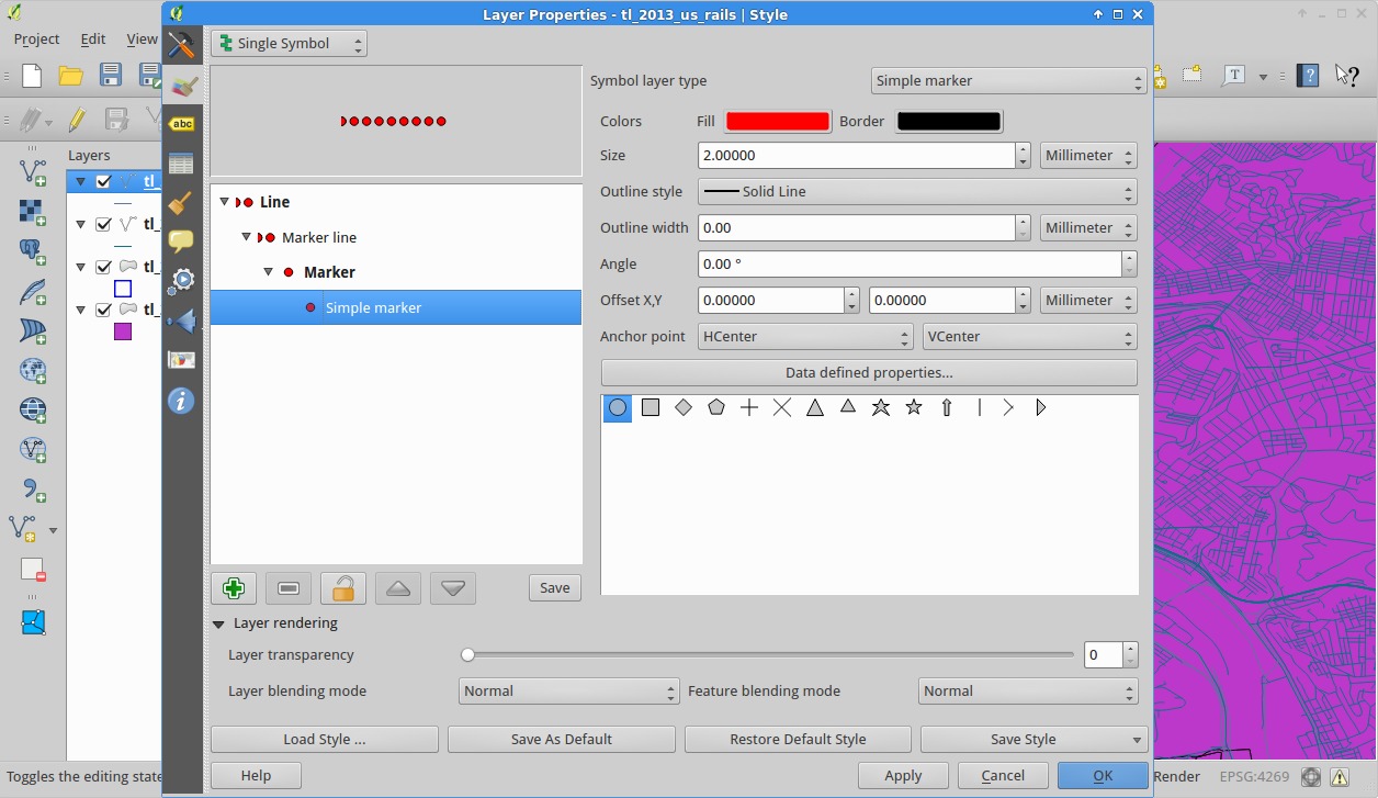
Select the “+” marker. Then, in the tree to the left, select “Marker Line” and set the interval to be 2.
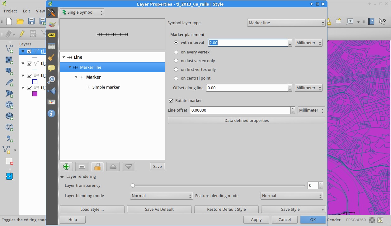
OK back to the main screen.
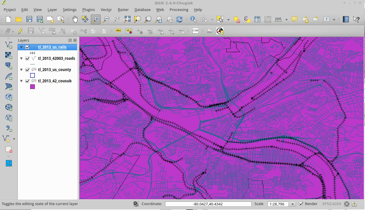
Better!
Back to roads
Select the road layer, and then use the “Identify Feature” tool to select an interstate highway.
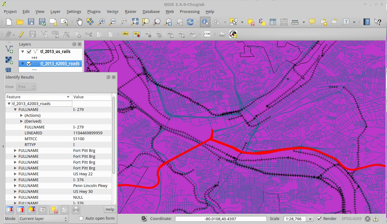
Now select a local road.
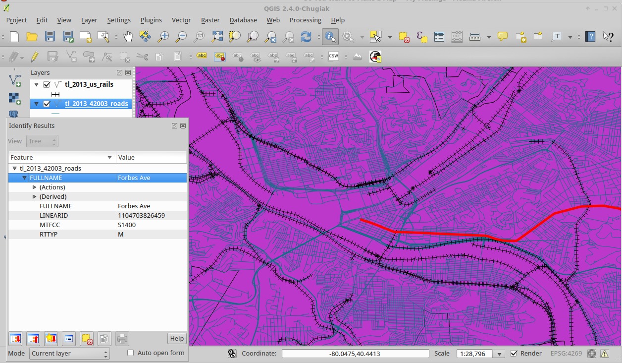
You’ll notice the “RTTYP” is “I” for the interstate and “M” for the local, or municply-owned, road.
Go to the style dialog for the road layer. At the top where the drop down reads “Single Symbol”, click it and select “Categorized”. Then for the “Column” select “RTTYP”, followed by clicking the “Classify” button under the big white area.

You’ll see the different values
| Value | Owner/class |
|---|---|
| C | County |
| I | Interstate |
| M | Manciple |
| O | Other |
| S | State |
| U | Unknown |
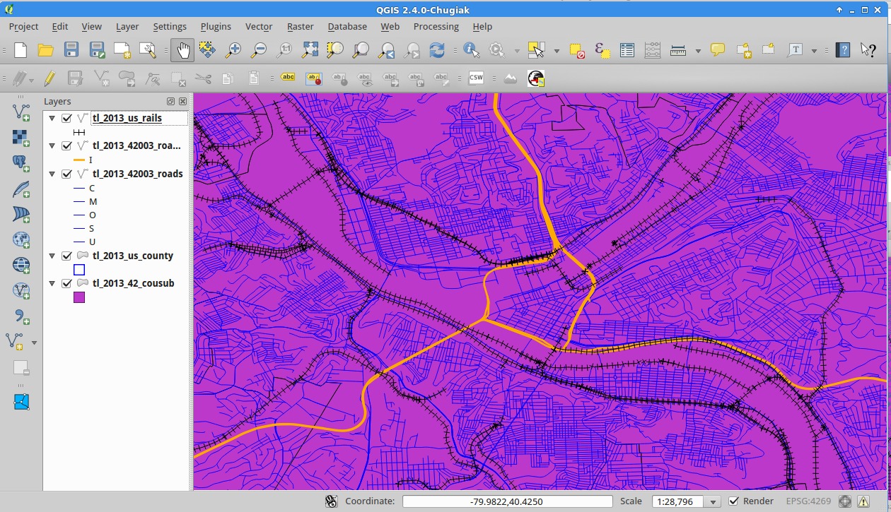
Right click on each value but “I” and change it back to blue. Also, delete the first entry, the one with no value.
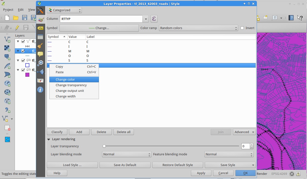
Now change the color of the interstate to orange and the width to 0.7. Ok back to the main dialog.

You may notice, like you can on part of 279 (currently 376), that some interstates have blue on them. This is because there are multiple shapes in the same spot with different records; in this case it’s being listed as a few different roads with different names. Life is messy, unfortunately. There are ways to merge records, but I’m not going to get into that now.
One easy method of solving an issue like this is to “Duplicate” from the context menu for the layer and show all the records you want in one style in one and the other in the other (using the delete function like earlier); since layers are rendered in order place the interstate above the local. (NB: Duplicated layers aren’t shown by default; check the checkbox next to it to show it.)
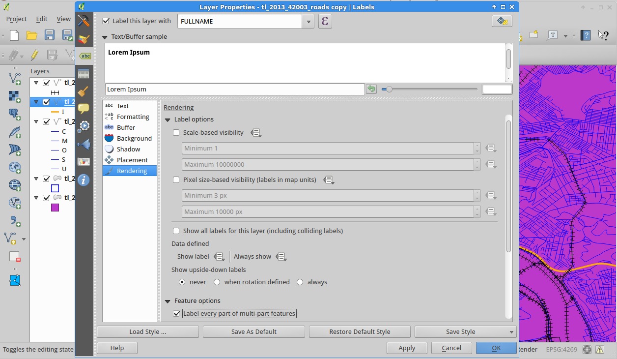
Another advantage of duplicating the layer is that we can label one layer and another (Currently QGIS has no way of only labeling certain features and not others in a layer).
Go to the properties for the layer, and click the “Label” pane ( ). Check “Label this layer with” and then select the “FULLNAME” field. Next, click “Rendering” and then “Label Every part of mulit-part feature”. Click OK.
Sometimes the label-placement engine is a little finicky, especially with very long roads. Try moving the map around a little (by clicking and dragging with the hand tool) to see if that’ll place labels where you want.
Now for a little exercise.
- Duplicate the road layer.
- Filter the layer so that only roads with FULLNAME is “Forbes Ave” or FULLNAME is “5th Ave” are showing (Remember what I said about quotes in queries).
- Make this layer’s style a “Single Symbol” of a blue-green line 0.5 in width
- Label this layer with the full name
More Data!
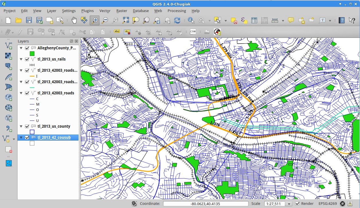
Since our tutorial deals with Pennsylvania, we’re going to use PASDA to find some additional information. Every state has a spatial data repository. Find yours; find some data; make some cool maps!
At PASDA, do a search for Allegheny and download the Parks file (ftp download and then uncompress it into it’s own directory. Then, you guessed it, add it to our map.
Once Added, go to the Style dialog to a green; something that says “park”! (Also, while you’r mucking around with styles, go to the style dialog for the municipalities and make it “No Brush”, just like you did for the county.
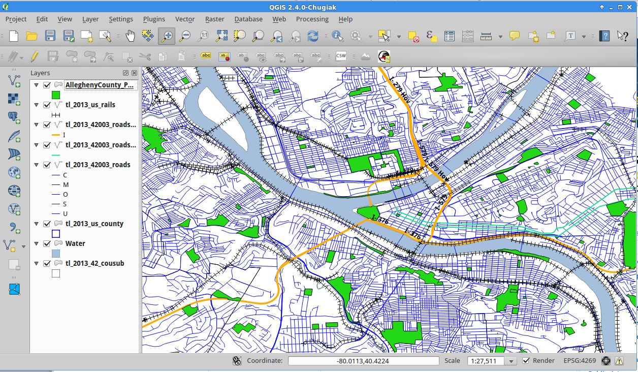
The City of Pittsburgh’s GIS team in city planning has the best “water” file I’ve seen. I honestly find it very difficult to get good GIS info on rivers. If you know where to find it, please tell me! Anyway, download and add the water file as before; and make it a nice water-blue.
Go back to PASDA and download the “pools”: file for Allegheny County.
It’ll be a bit lack luster when we add it. Go to the style dialog and set a “Centroid Fill” for the “Symbol layer type”.
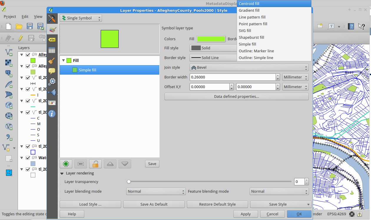
Then set the “Symbol layer type” to “SVG Fill”.
Finally, select the “Swimming” icon from “gpsicons” from the really nice library of icons QGIS comes with. In order to see the icon better, set it’s size to 8.
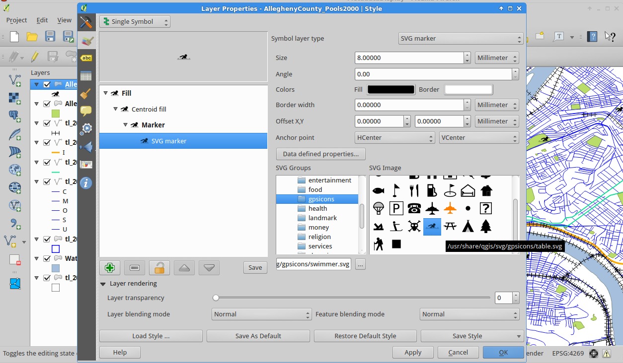
Click OK and admire your work!
Next time
In the next installment, I’ll show you how to use the print composer to make nice printouts of your maps, and go over some more data querying.